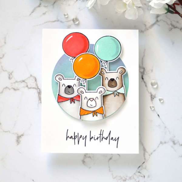
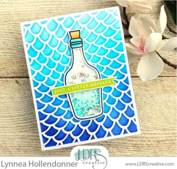
I love creating scenes on my cards but sometimes it’s a lot of work and sometimes I might want to keep things simple or I don’t have a lot of time. This idea from Therese is perfect for these instances, … Read More...
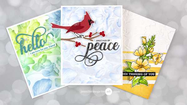
Techniques with Embossing Folders
Embossing folders are a simple way to add depth and texture to your cards. Simply place cardstock in the middle, run it through your manual die cutting machine and that’s it, or is it? There are actually many more techniques … Read More...
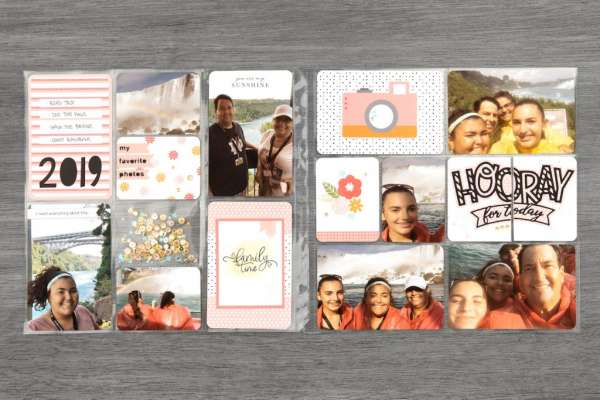
20 Tips for Pocket Pages
Pocket pages are quick and easy ways to put together a fast scrapbook layout. But you don’t want them to all start to look that same so Close to My Heart is here to give you 20 helpful tips for … Read More...
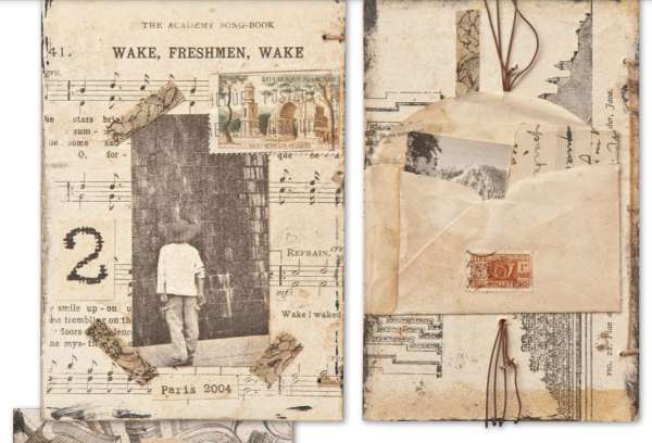
Vintage Looking Photo Album
Sharon Payne Bolton created an amazing album using new photos but made it appear as if it was an old family heirloom. Printing her new photos in black and white or sepia tones gave them an aged look and using … Read More...
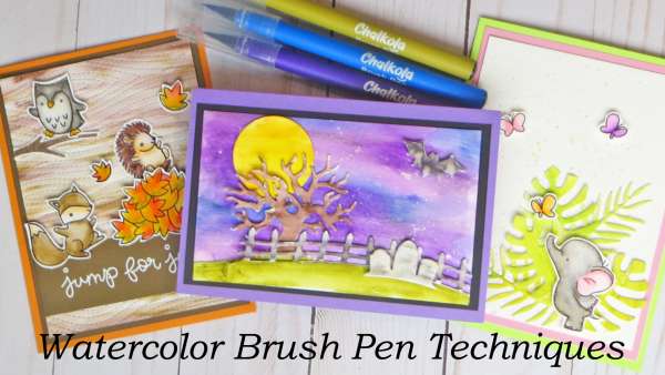
7 Techniques with Watercolor Brush Pens (and a Discount!)
I recently got the chance to try out the Watercolor Brush Pens from Chalkola. Last year I shared how you could use their Chalk Markers in your paper crafting (click here if you missed it) and now … Read More...
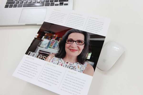
Make a Hybrid Page About Yourself
Cathy Z is sharing some tips on how to create a Hybrid scrapbook layout all about yourself. Using one the digital templates available in her store she’ll show you how to add a photo and text on your computer. This … Read More...
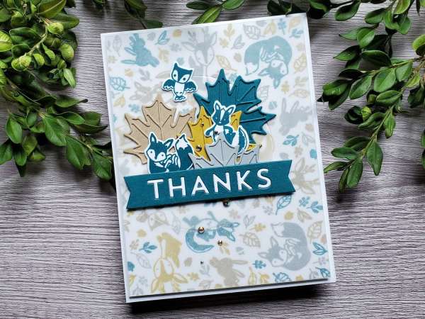
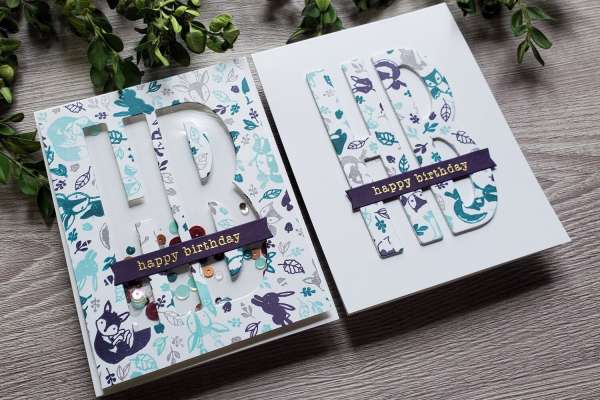
5 Card Ideas with Turn About Stamps
Turn About Stamps allow you to easily create colorful stamped patterns and backgrounds for your cards. Daniel West shares how to use stamps from Concord and 9th along with a stamp positioning tool to create 5 different card ideas.
How to Watercolor with Re-inkers
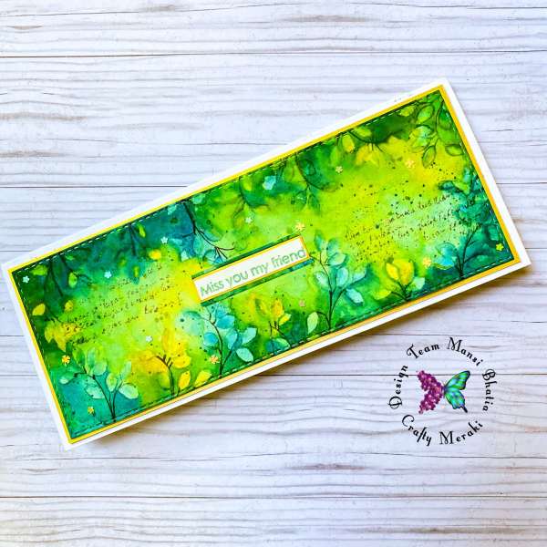
Did you know re-inkers aren’t just for re-inking your ink pads? You can also use many of them alone as a a way to color or paint! Mansi used her Distress Re-Inkers to watercolor this beautiful Slimline Card. Using a … Read More...
Masculine & Feminine Layouts w/ Same Papers
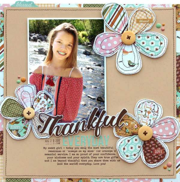
Lisa Dickinson has some great tips for getting more from your pattern papers. She used the same paper to create both a masculine page and a feminine page. By using the paper to create different design elements like flowers and … Read More...
Cottage Scene Card
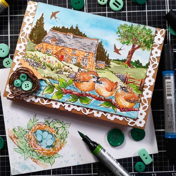
Lindsay combined several stamps from Top Flight to create this lovely Cottage Scene Card. By using a masking technique she was able to give depth and dimension seamlessly to her scene. I love the little bird nest embellishment she made … Read More...
Spectrum Noir Tri-Blend Brush Marker Review
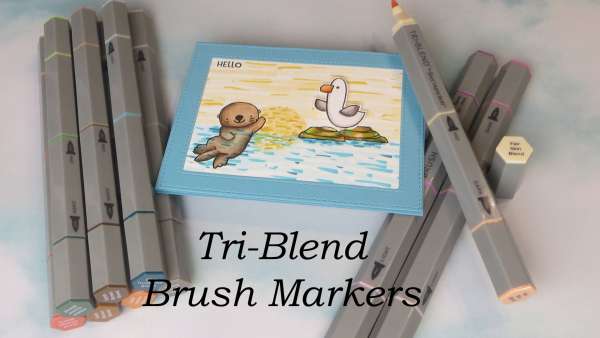
If you’ve watched any of my card making videos or tutorials in the last year you’ve probably heard me say how much I love Tri-Blend Markers from Spectrum Noir. They have quickly become my favorite alcohol based marker. So … Read More...
Crackle Card Background
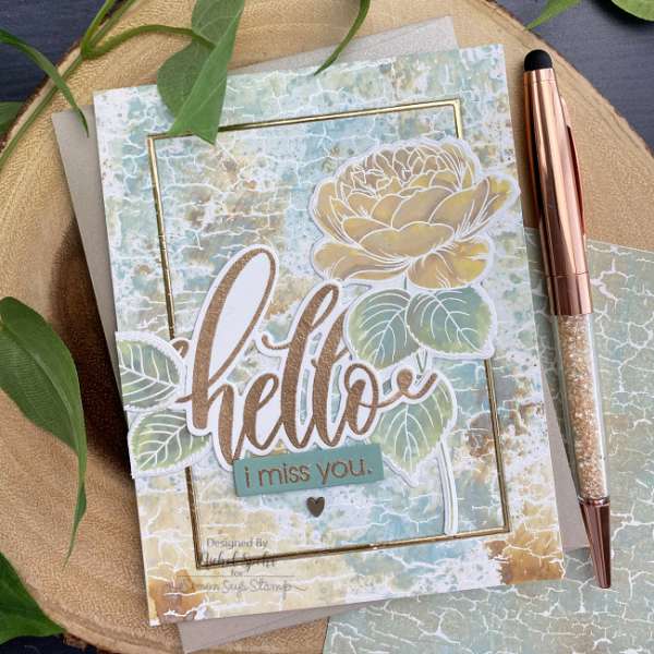
Wow, check out the stunning background on this card from Nicole Spohr! She heat embossed a Crackle stamp on her cardstock and then used an ink smooshing technique with Distress Oxide Inks over top for some amazing looking texture. She … Read More...
Spotlight Coloring Technique
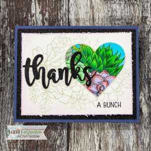
Add some interest to you next stamped card with the Spotlight Coloring Technique. Instead of coloring the entire image you can choose just a section to color in. Echo used a heart shaped die to cut out part of a … Read More...
Design Tip: Gradually Sized
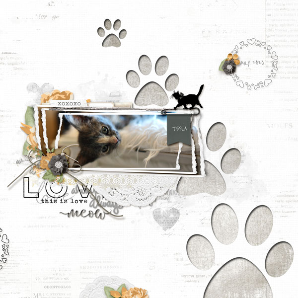
Stuck on a layout design? Try this easy tip of using gradually sized photos or embellishments. You can use a series of photos that gradually get smaller or a set of elements each one a little bigger than the next. … Read More...
Layering Stamps with Embossing
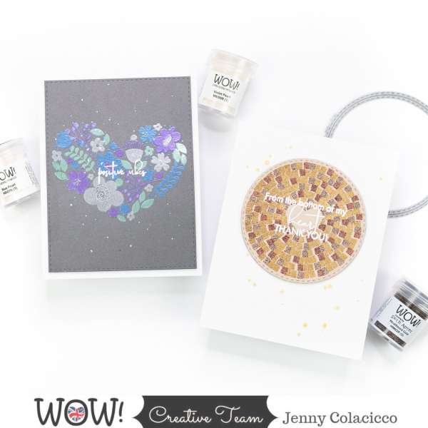
Layering stamps usually are used with different colors of ink to create a multicolored design but Jenny had the terrific idea of embossing each layer instead. She used metallic and pearl embossing powders from WOW! with stamps from A Pocket … Read More...
Dot Coloring Card Technique
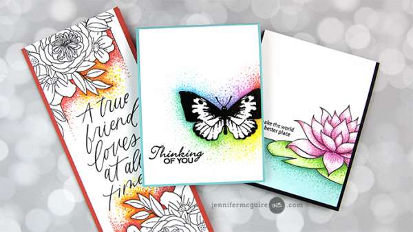
Jennifer McGuire has a cool take on coloring with markers using dots. By tapping the tip of a markers around the outside edges or even coloring in a stamped image with dots you get a fun pixelated pattern and can … Read More...
Beach Day Focal Layout
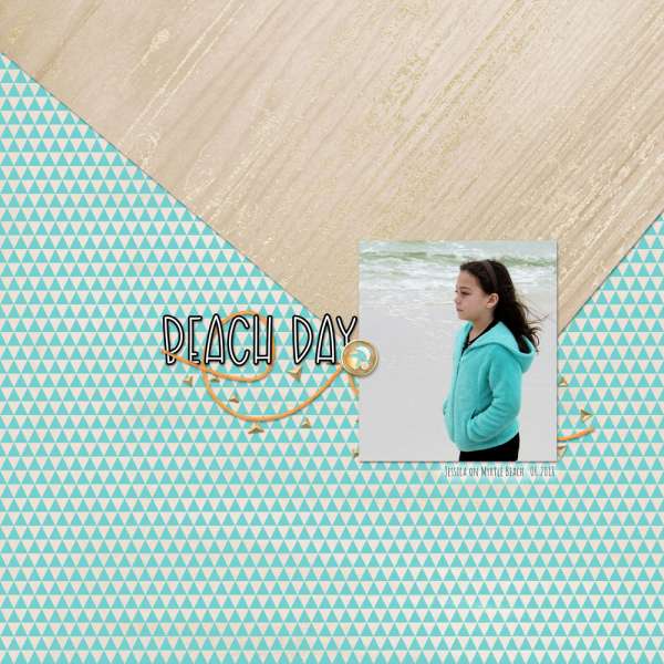
A quick and easy way to create a focal point on your layout is with paper. These two papers form a loose arrow pointing straight to the photo, drawing the eye in and anchoring the layout. A title and some … Read More...
Faux Watercolor Technique
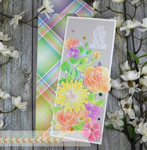
Amy R. has a terrific tip on getting the look of watercolor with out actually water coloring. For her faux watercolor technique she heat embossed her stamped images in white on white cardstock and then rubbed water reactive ink pads … Read More...
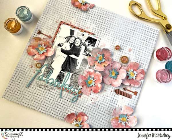
Floral Layout with Shimmerz Paints
Jennifer McMurtrey used a smooshing technique with different colors of Shimmerz Paints Creameez to color the die cut flowers on her layout. Each one has it’s own unique marble and splattered look that she carried over into the background of … Read More...
