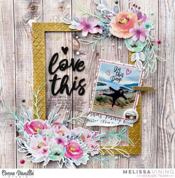
I love the mix of hard and soft on this layout from Melissa. The mixture of the woodgrain background with the pretty florals works so well together. The large gold frame helps pull the eye towards the center of the layout bringing focus to the title, photo and journaling.
Visit the Coca Vanilla blog for more info.
-Heather

